Tips for Designing and Renovating a Tract Home Fireplace and Media Niche
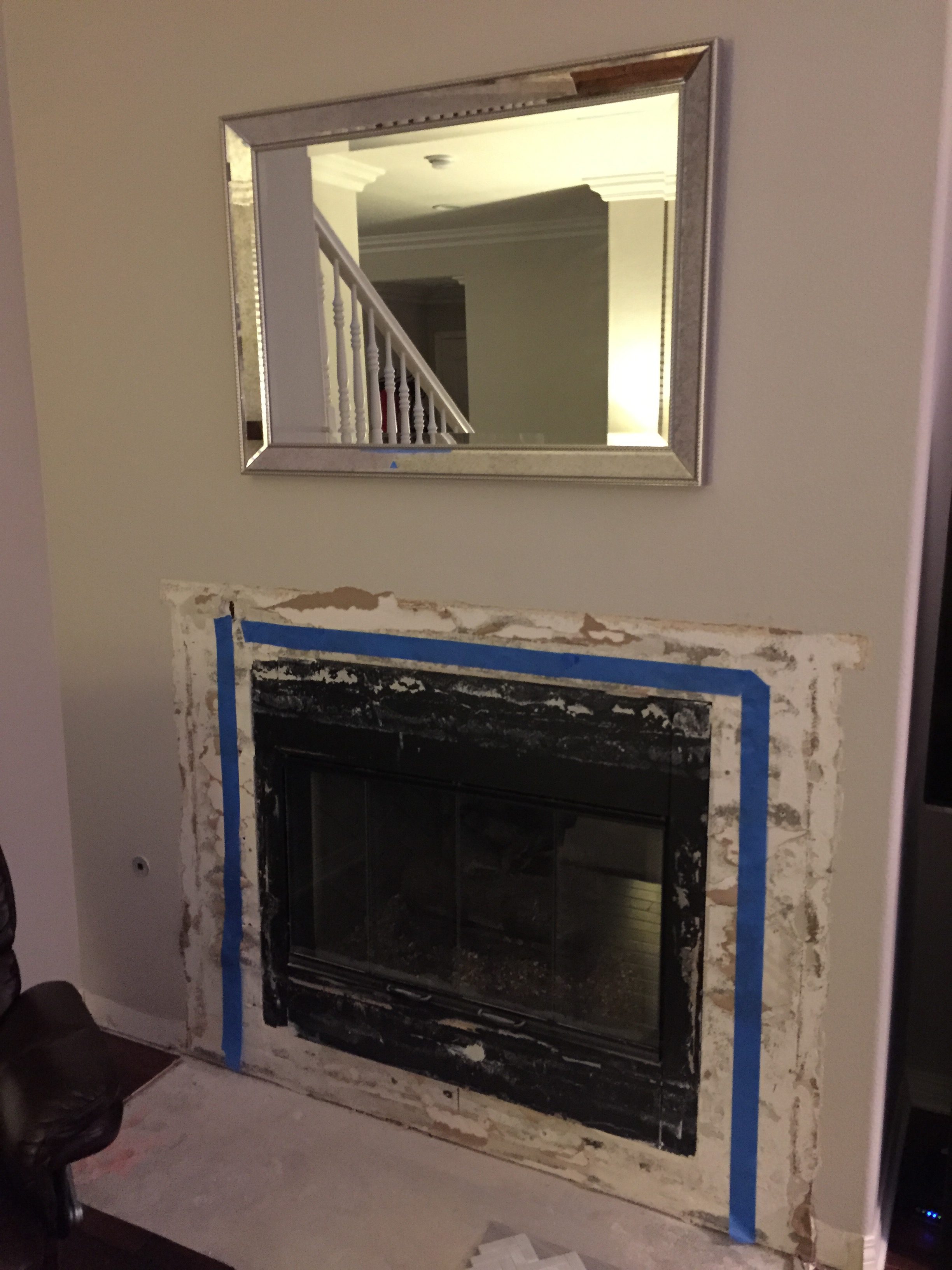
Hi everyone! Today I’m sharing tips for designing and renovating a tract home fireplace and media niche. When we moved into our tract home 4 years ago it was a blank slate and looked like this (apologizing in advance for the not so great photo quality but this is all I have!):
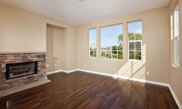
We painted our entire home with a light grey paint color getting rid of that basic builder beigey yellow. No offense to any beigey/yellow lovers it just wasn’t for us! We decided the stacked stone look had to go. It wasn’t our style and the large stones and fireplace “took over” our smaller family room area. My “go-to” and favorite grey paint color can be found here.
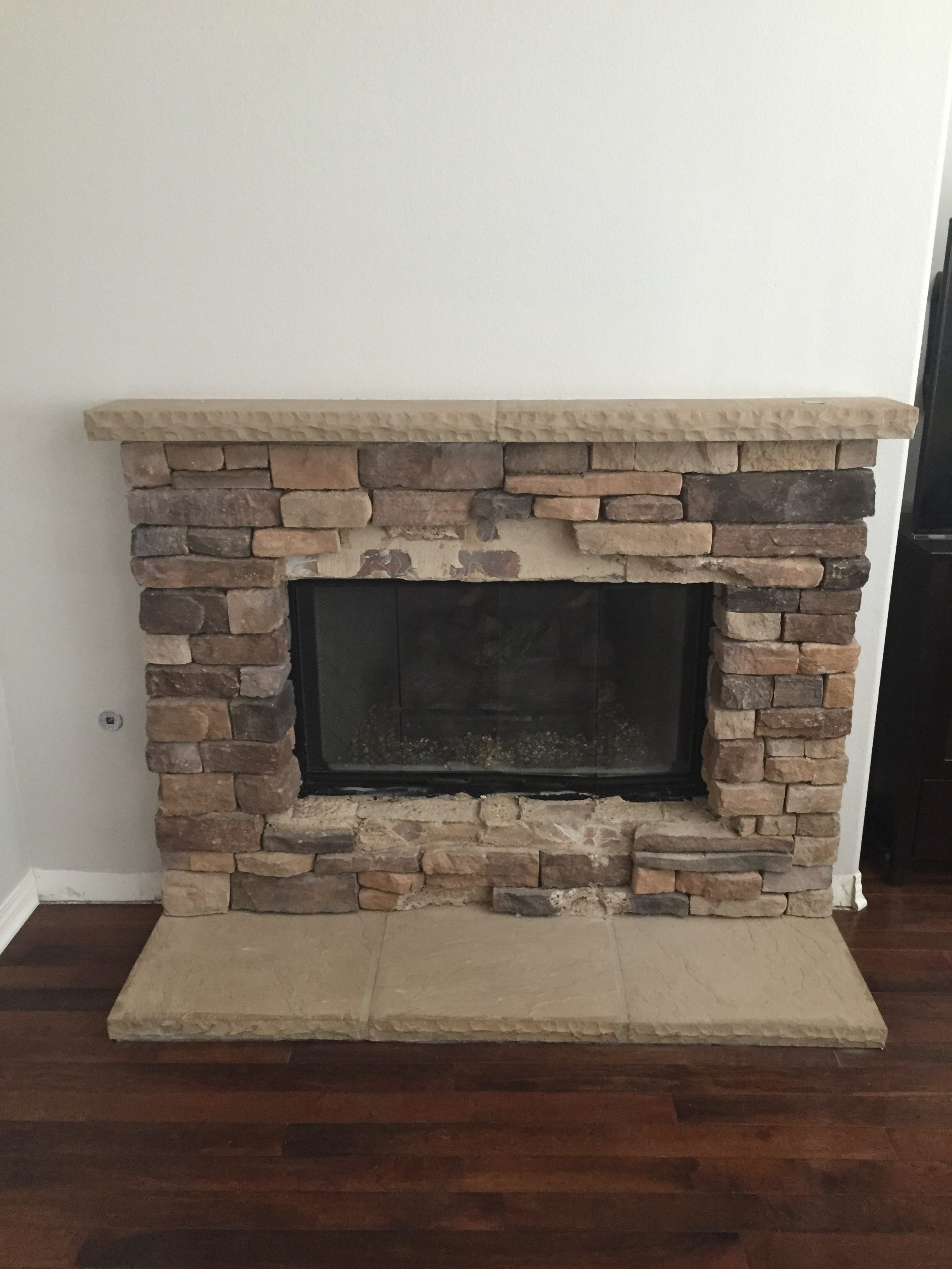
When we first moved into our home I was expecting baby #2, feeling lousy, and was in no rush to take on a fireplace renovation project. We decided to wait until we figured out exactly what we wanted to refresh our fireplace. Almost everyone in our neighborhood has the exact same fireplace (insert eye roll here) and we wanted to put our personal touch on ours to make it unique and different.
Fireplace and Mantel Inspiration
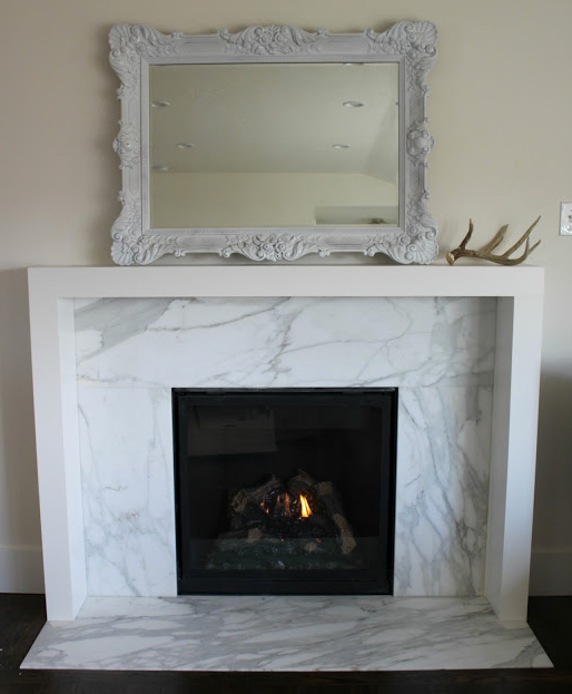
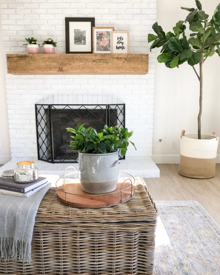
I searched Pinterest for inspiration and came across a simple mantel with a marble surround that I loved. I also loved the look of a shiplap wall and floating shelves above our TV/media niche. Keeping our budget in mind I knew marble wouldn’t be an option – definitely too pricey knowing this isn’t our forever home. I went for a quartz surround that looks similar to marble. Working with our fabricator that we used for our kitchen countertops I asked to view their quartz remnants (aka their leftover scraps) they had and utilize one for the fireplace surround – this saved us a lot of money! If you live in the San Diego area you can find our fabricator here.
Here’s a look at my fireplace and mantel inspiration:
The Renovation Process
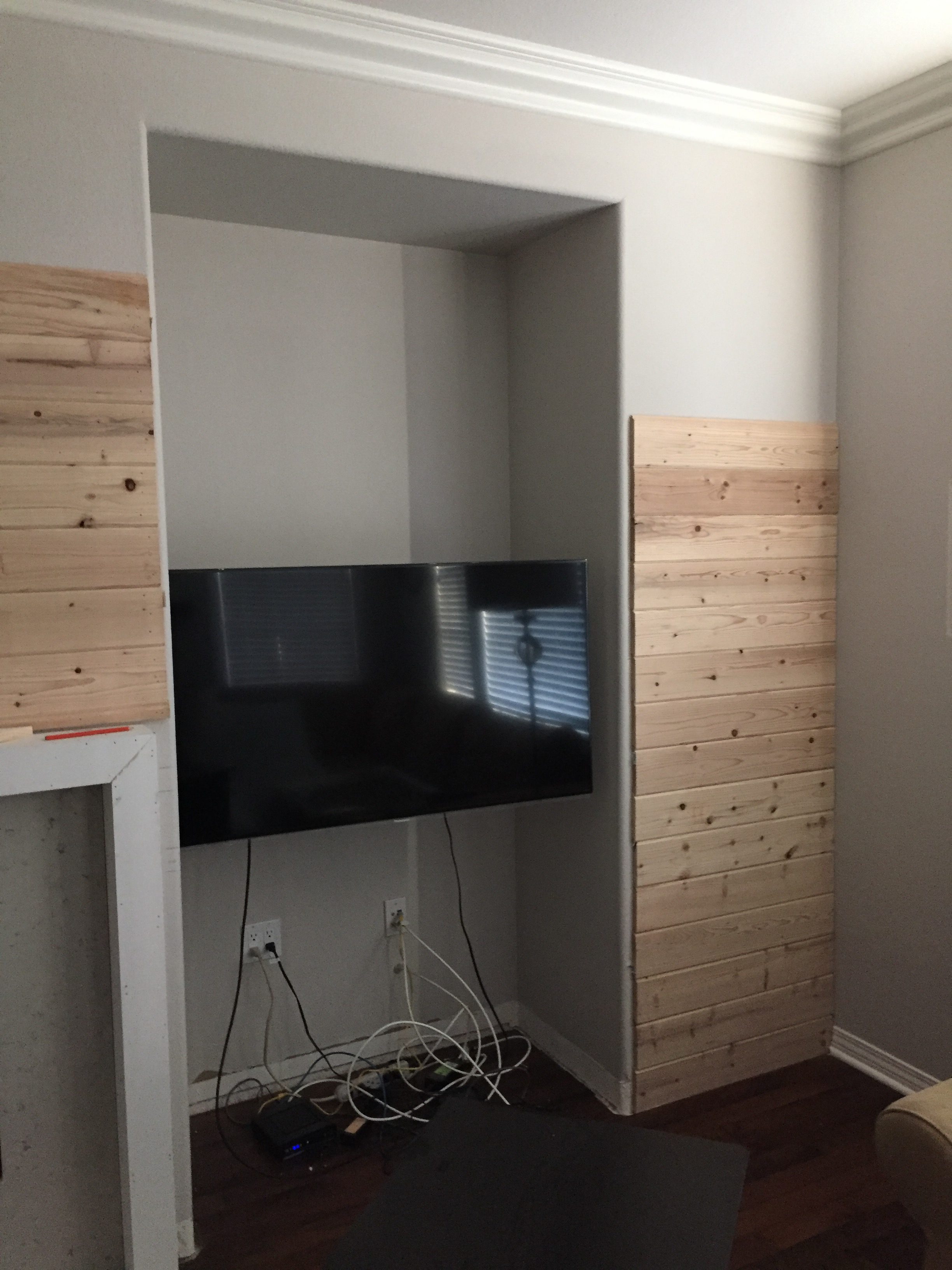
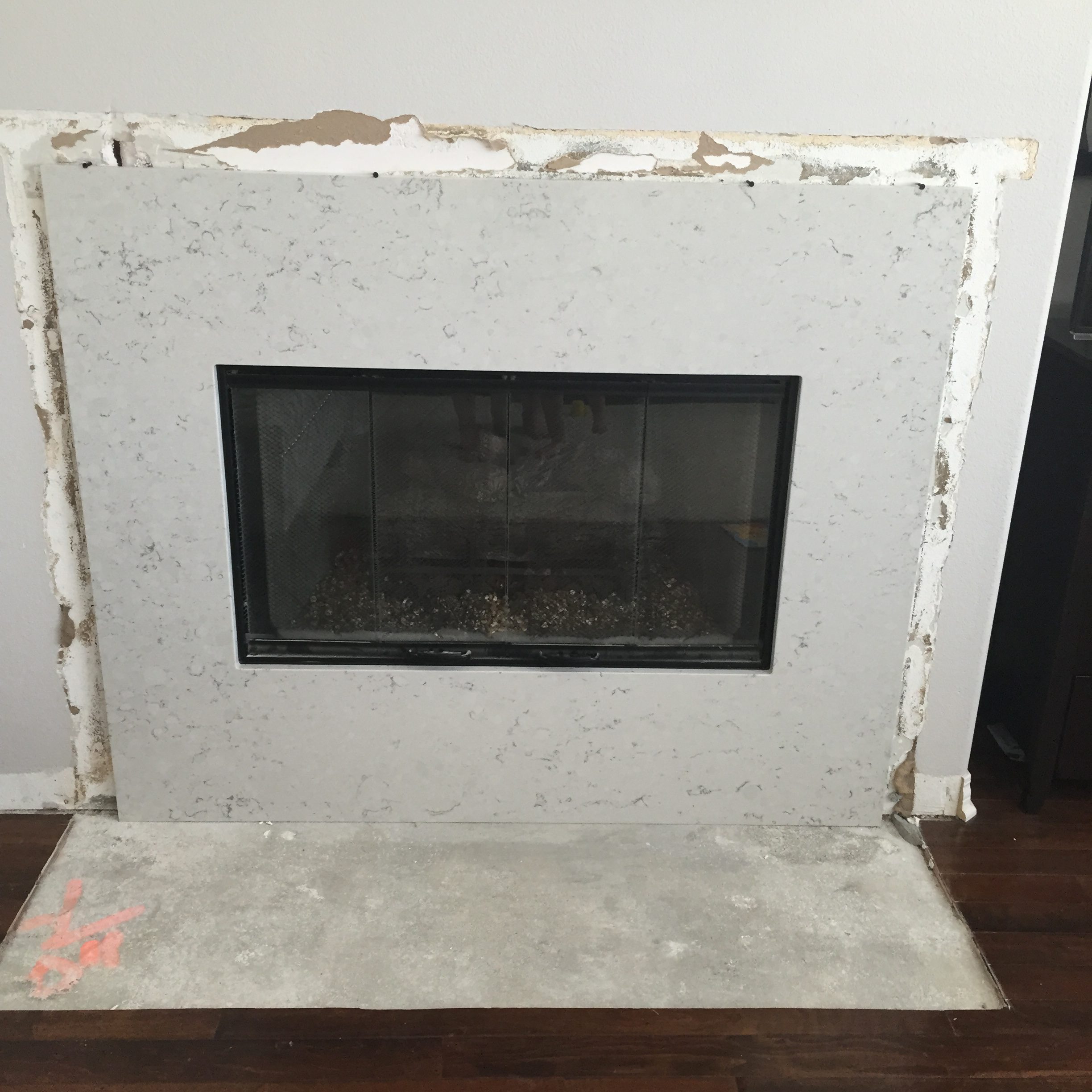
Grabbing a pencil and blank piece of paper I literally sketched and drew what I wanted for our contractor. I then met with our fabricator and picked out samples of what I wanted so they could keep an eye out for remnants with a similar look. I then headed to their shop and chose the quartz remnant I liked the best! I met with our contractor for the mantel surround, media niche and shiplap wall showing him pictures and my drawing and then the demo process began. Here are the progress pictures, you can see how it evolved. Instantly it felt more open with the stacked stone removed and bulky hearth removed.
Progress pictures:
We added crown molding to our family room, window casings, and shiplap to the fireplace wall. This gave the room character and made it look more custom and less basic and builder-grade. The paint color we used for the molding, mantel, media niche and shiplap is White Shadow.
I made sure the width of the quartz surround was substantial enough for the area surrounding our gas fireplace. It is important to make sure you consider the scale so it looks balanced. Also consider the width of the quartz surround to account for the mantel that will cover the top and sides.
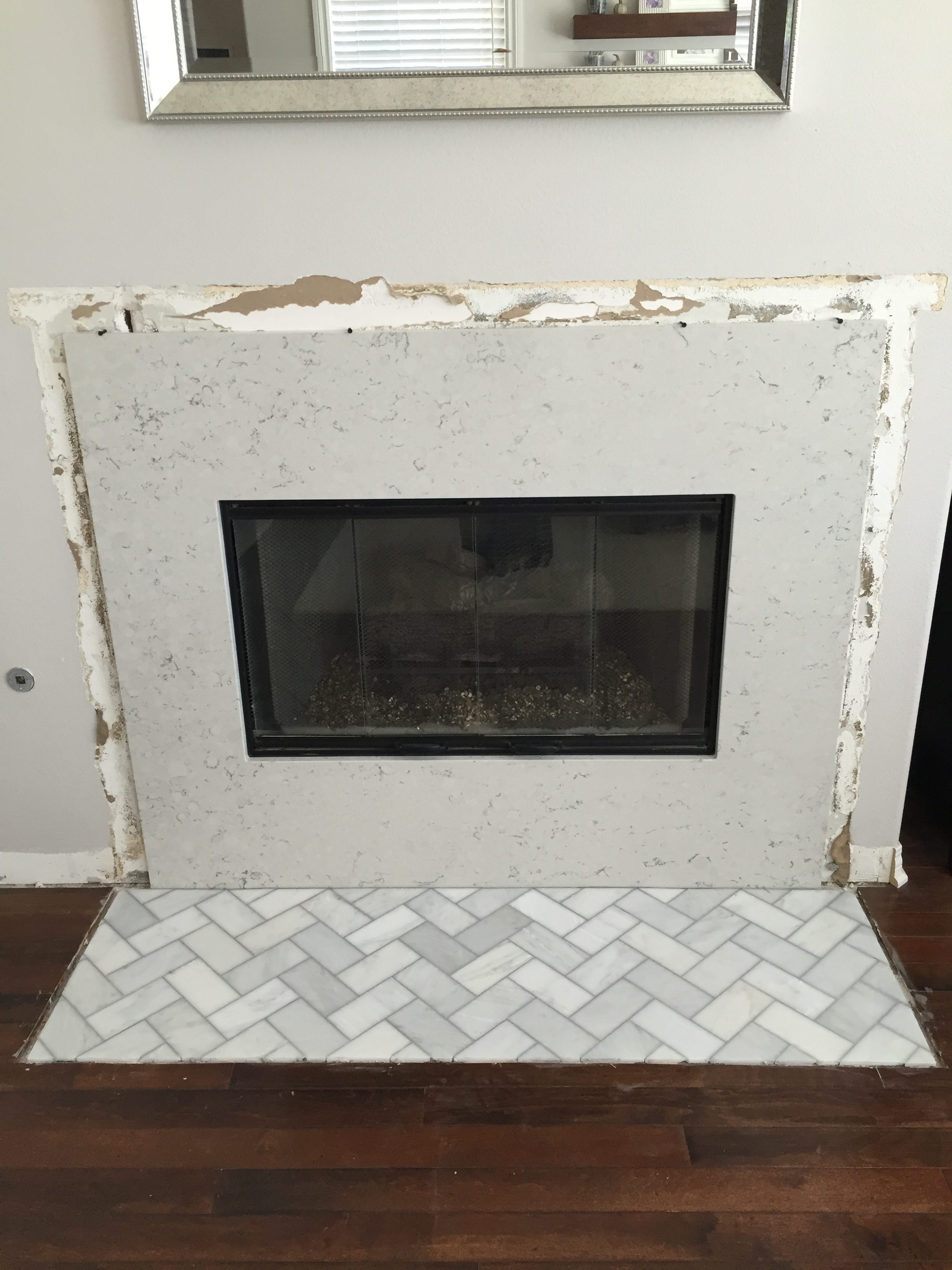
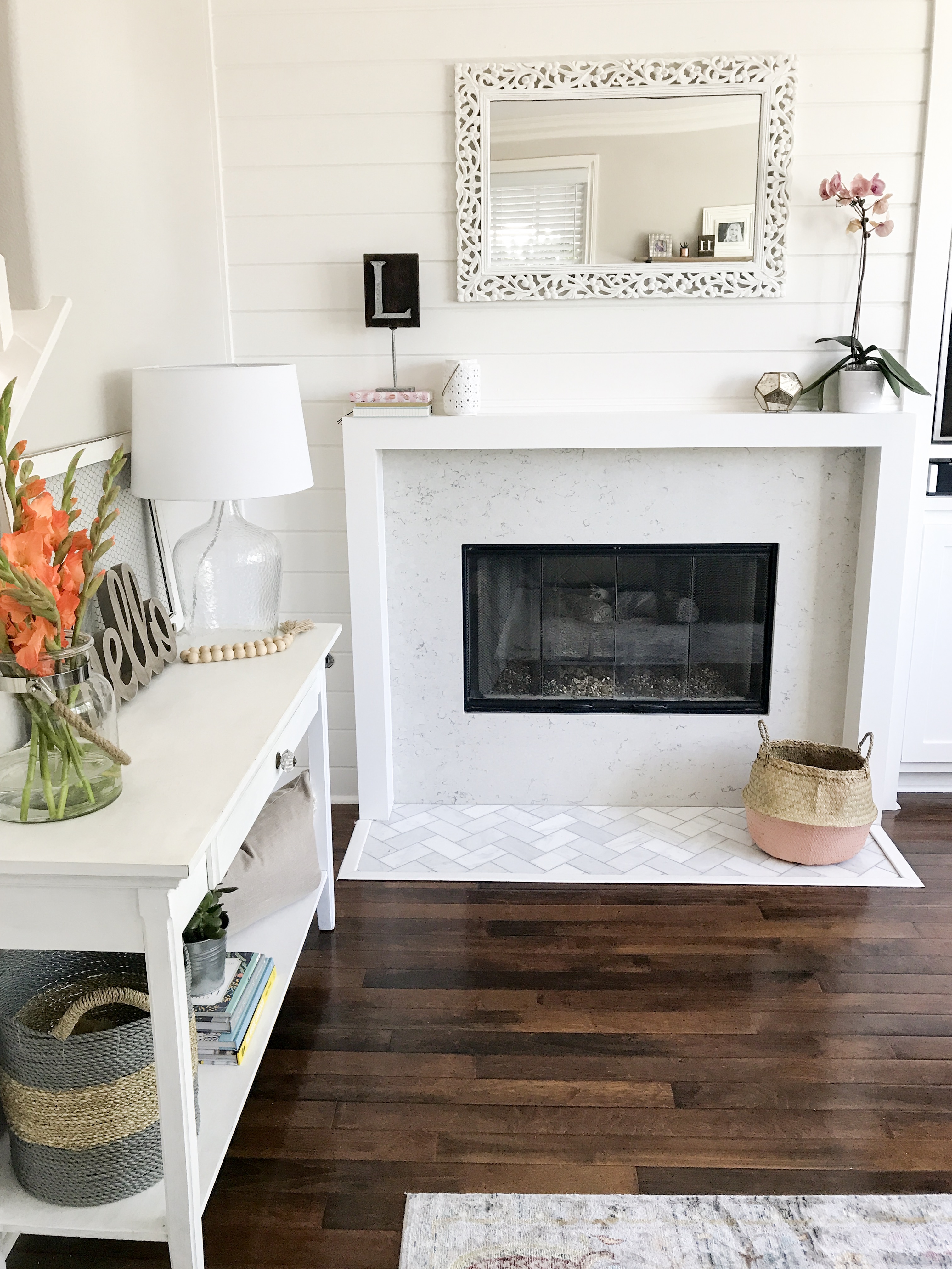
I chose a herringbone pattern with a 3 x 6 marble subway tile for the hearth. The grey grout compliments the grey in the quartz surround. We had to add a border around the hearth since there was a gap between where the old hearth was and the hardwood flooring. Grout color we used is platinum.
Here are some links to shop similar tile options:
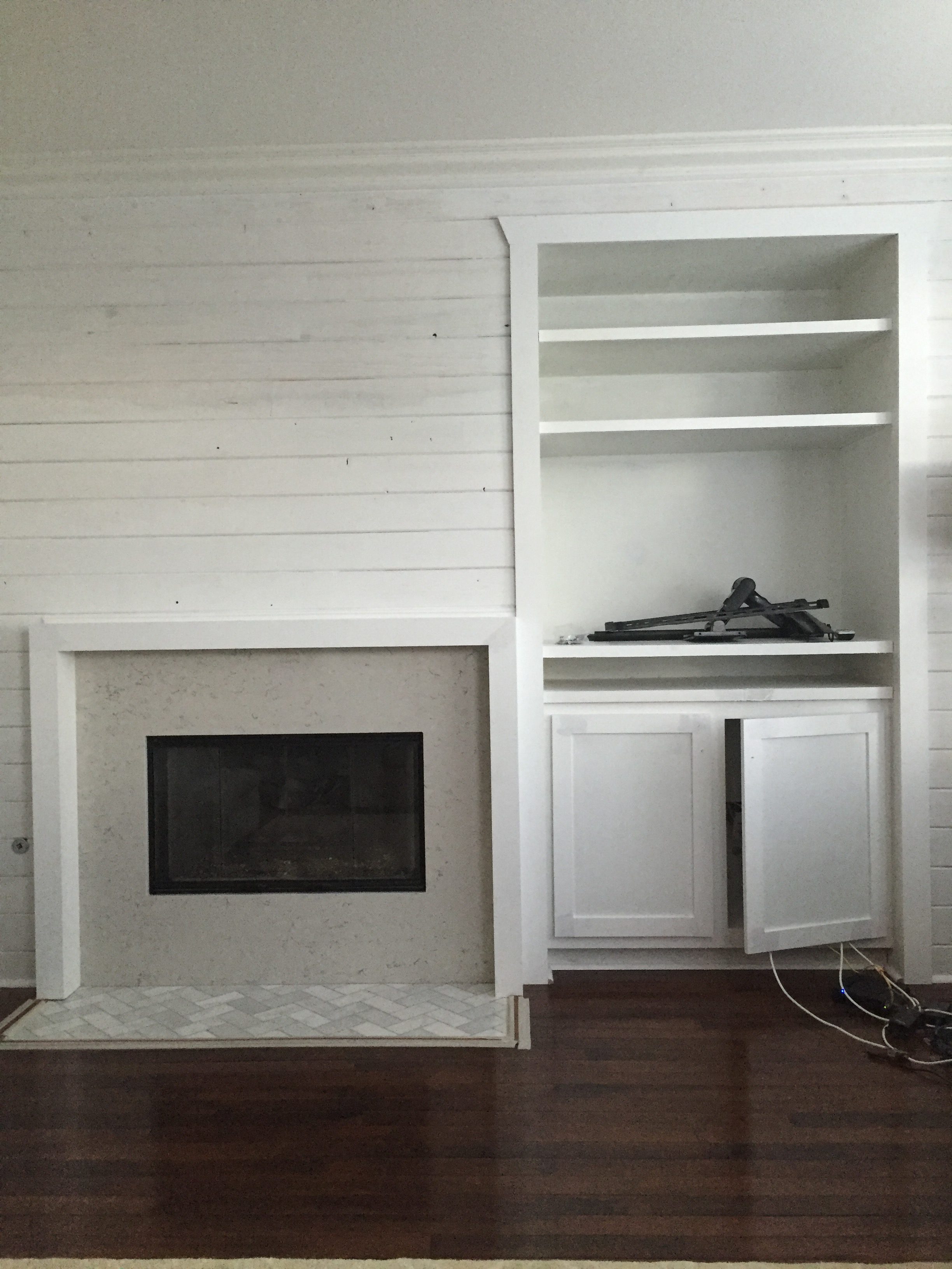
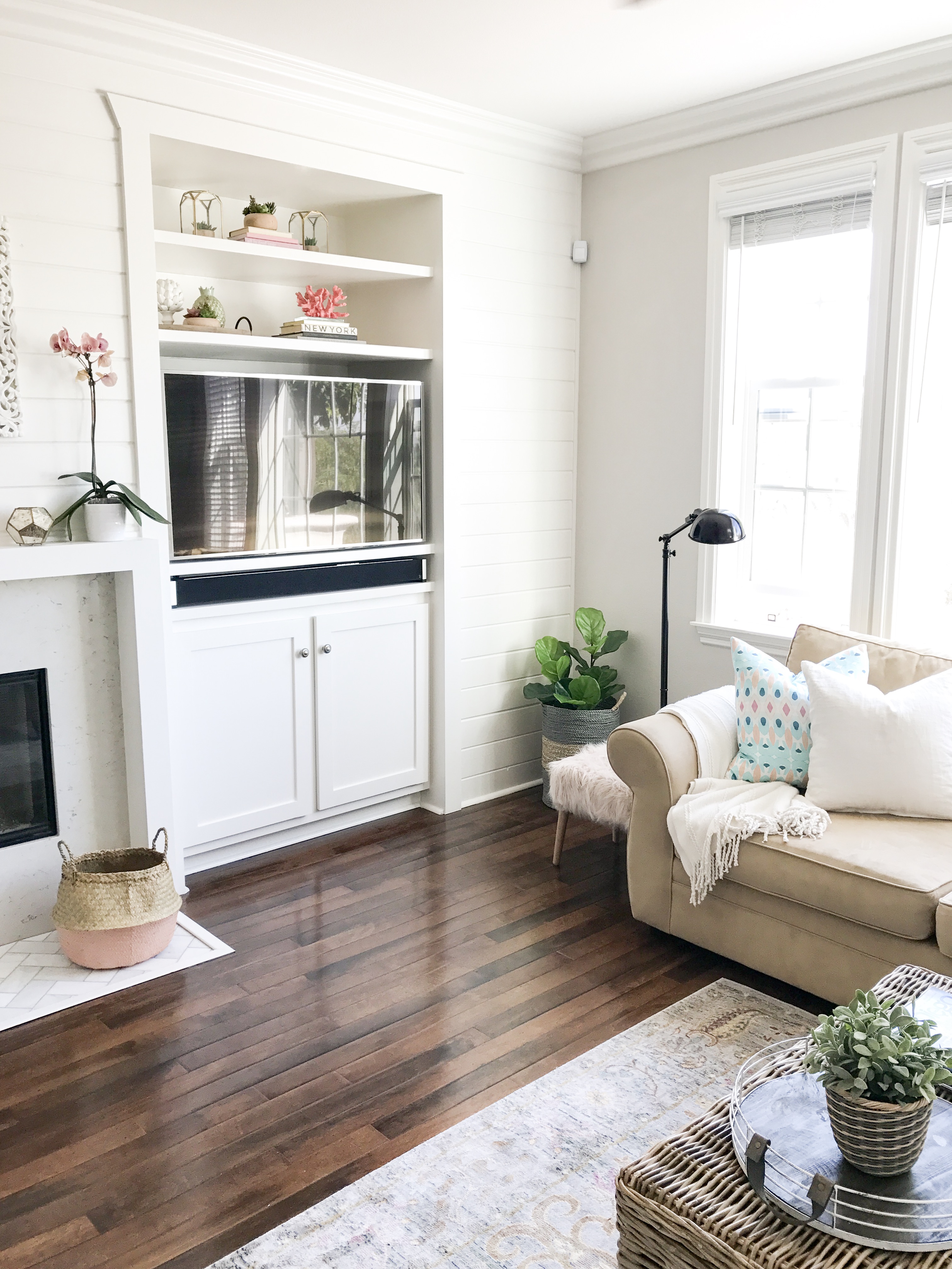
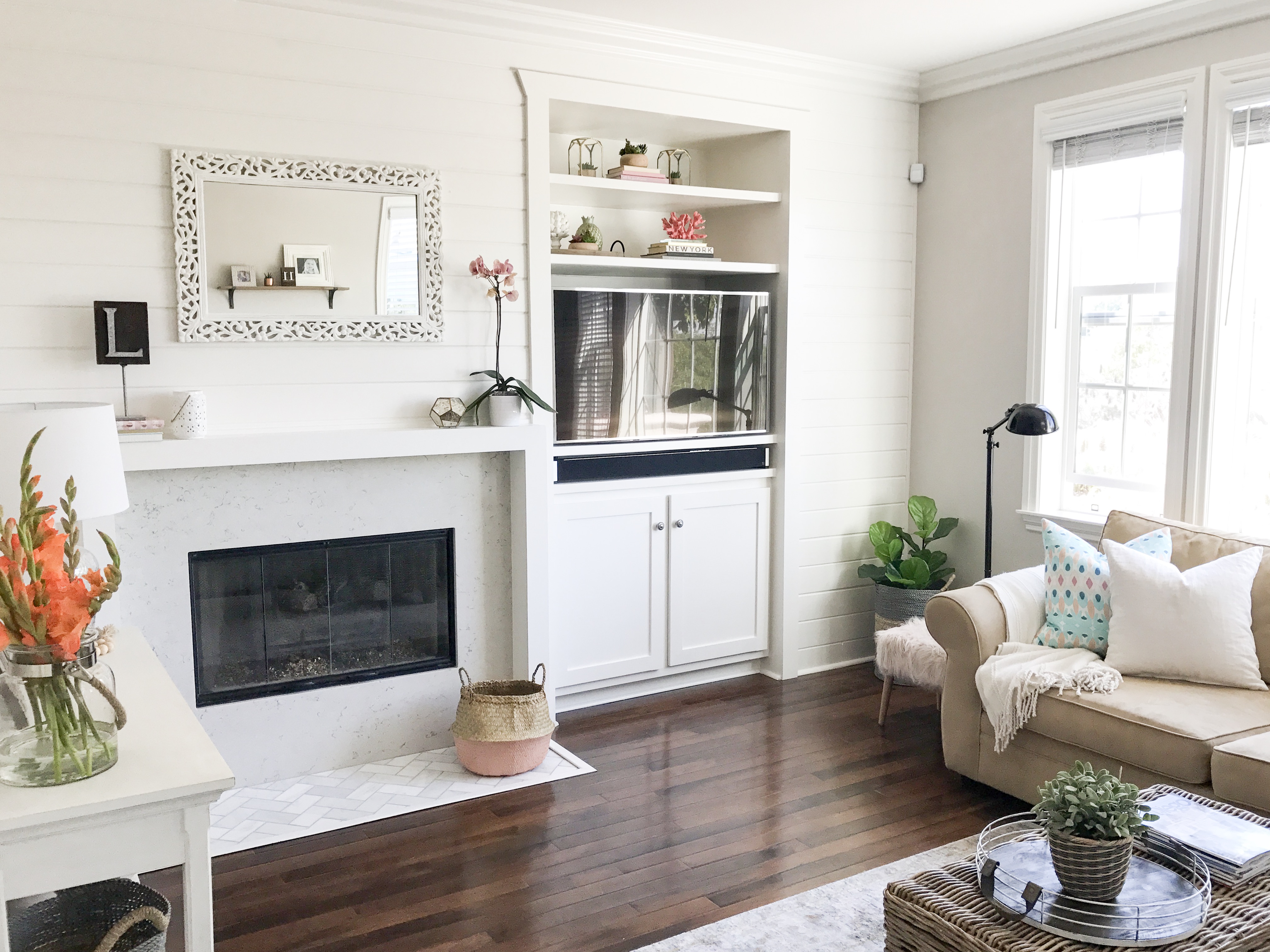
The media niche for the TV area was in major need of a built-in. I chose a cabinet for below the TV to hide toys and wires and 2 floating shelves for above the television because I love a good “shelfie” – I mean who doesn’t?! I also created a shelf and space for our sound bar per the hubby’s request! lol! You can find our sound bar here.
Here are the “after” pictures:
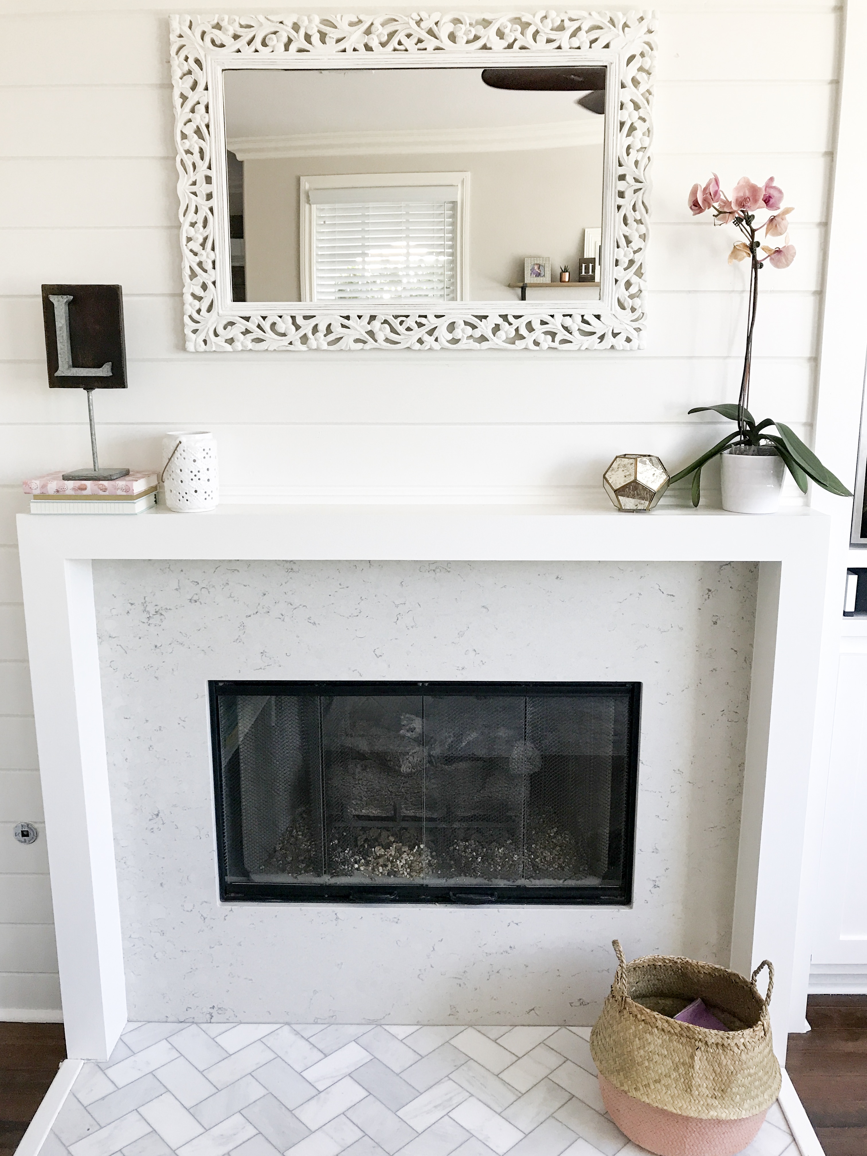
I’m so please with how it turned out! It completely transformed the space making it open, airy and bright.
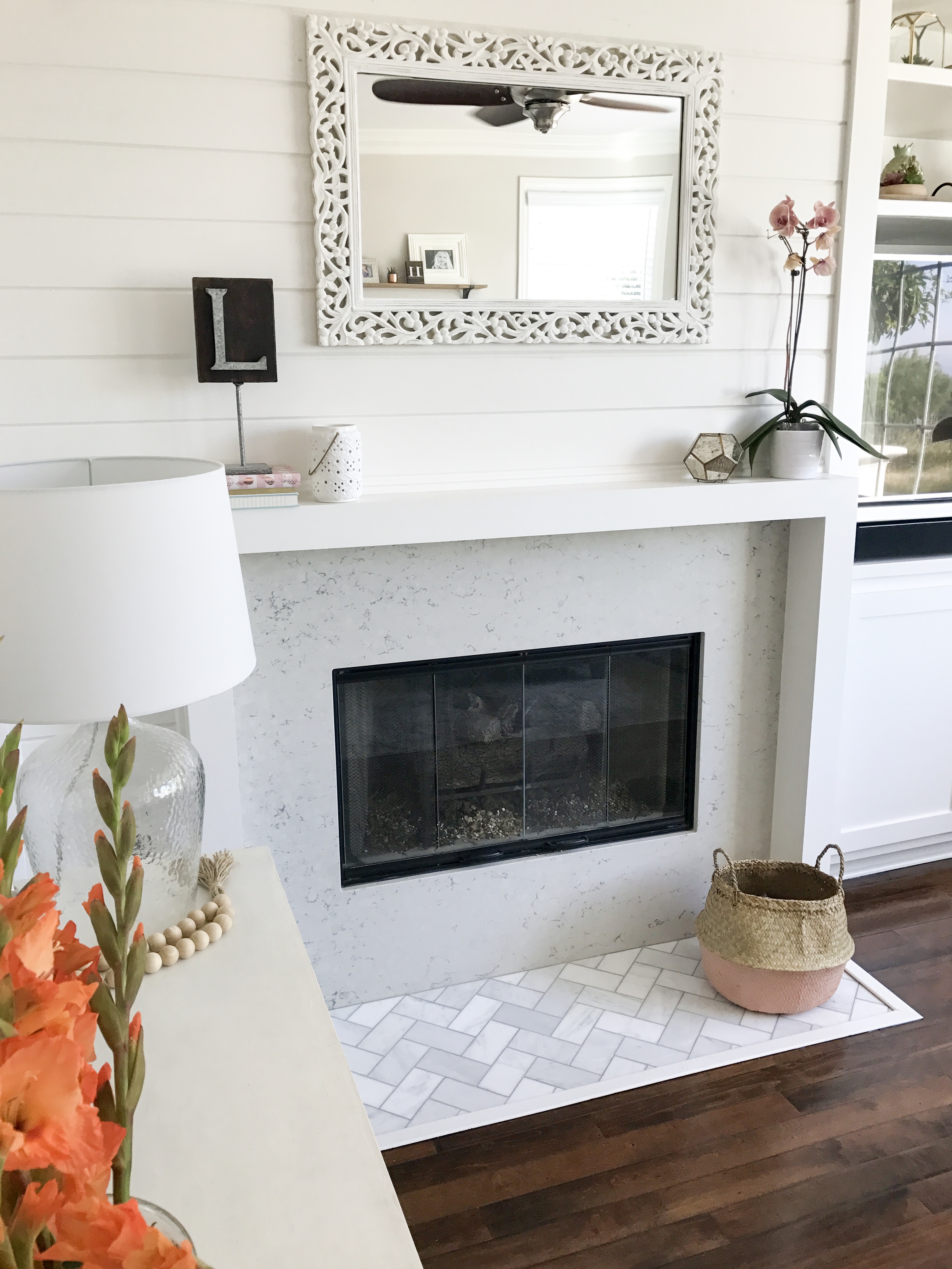
I love the sleek, modern element to the mantel and the shiplap wall adds a farmhouse touch. You can see how I’ve styled our mantel throughout the year by heading here, here, here, and here.
It’s so fun styling the floating shelves and our TV and sound bar fit perfectly in the media niche.
Here are my Fireplace and Media Niche Design & Renovation Tips
- Be clear about your vision & direction: know what you like and what you don’t so you can communicate it to your contractor or if you are diy’ing have a clear direction.
- Look for alternative options: If marble is too pricey go with a quartz remnant like we did and saved thousands of dollars. Or utilize a tile surround that looks higher but doesn’t cost a fortune.
- Make sure you account for fire safety considerations: consider your hearth area and the surrounding areas of the gas/wood fireplace making sure your materials can withstand heat and are fire safe.
- Mantel Design: are you more traditional, modern, or do you prefer a minimalist look? This matters when you are considering how much molding and trim you consider for your mantel.
- Mantel Depth: If you go through all of the trouble of updating your mantel but don’t ensure it’s deep enough to set objects/decor on it than it defeats the purpose of having a mantel!
- Don’t be afraid to ask for help – many of you who found our fireplace and built-in update on Instagram asked if our project was a diy and the answer is no – but you can! Our contractor was super reasonable and it made sense for him to complete the project since he was working on a few other things in our home. You may want to give it a try though and I think it is a great project to diy.
- Consider function – your fireplace design, mantel and media niche needs to compliment your space and fit the necessary elements. I measured ahead of time for the sound bar, TV, TV bracket, and how far apart I wanted the shelves to ensure I maximized and utilized the space appropriately. I also love the function of the cabinet for hiding toys and unsightly media wiring.
Shop Tile Options here:
Shop Our Family Room here:
Shop More Family Room Decor & Accessories and Items for the Perfect “Shelfie” Here:
I hope you enjoyed my tips for designing and renovating a tract home fireplace and media niche! Have you tackled a similar project? Share it with me and tag your posts via IG or comment below!
As always thank you for stopping by!

*Affiliate links used, all opinions my own. My tips are based on my experience. You should always consult a licensed contractor for any home renovation questions or projects.



Hi Beth. I am about to renovate our fireplace and really like the look of yours. What size lumber did you use for the border around the hearth?
Hi! Thank you! This was such a fun project – unfortunately I can’t remember the size we used for the border but I do remember I wish I had gone with a little more depth for the mantel portion. Sorry I couldn’t help more! Good luck with yours!
I would love to see some more deleted pics of your media cabinet if possible. Is like to do something similar.
Hi, thanks for sharing your process and the pictures. We have almost the identical set up as this and I love how you’ve updated it! The only difference in our home is the fireplace and niche are off set to the left hand side of our large long wall, so the wall extends another 10 feet to the right. What would you suggest I do with the rest of the wall? I’m happy to send a picture if that would help!