Kitchen Renovation Update: Design + Source Details
Today I’m sharing our kitchen renovation update: design + source details for you!
Initially I had a larger scale kitchen renovation plan in mind. However after living in our home for almost 2 months now and using our kitchen daily I realized a couple of things:
1. How functional our kitchen layout is…
2. I love cooking in our new kitchen – the flow is amazing!
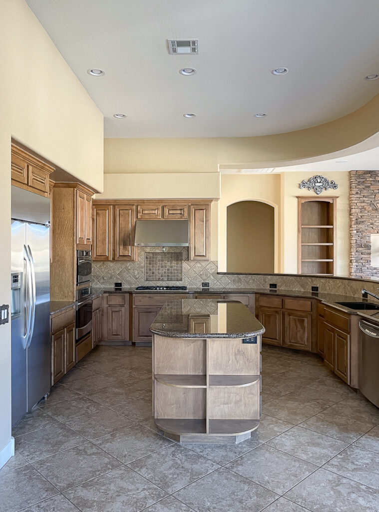
Unless you design a custom home there will always be little quirks and things you may not love about a home or space. Our last kitchen I was able to completely gut our fixer upper down to the studs and there were still limitations with respect to the kitchen layout and space functionality. Why do I bring this up? Because typically there will always be compromises in some shape or form when renovating homes. Especially when you don’t have an unlimited budget.
Kitchen Design Details
Kitchen Island
I would love to have a large island for stools like our last 2 kitchens but also realized I love our current large island for cooking prep. So we decided we will be removing the shelves on the end of the island. This will accommodate 2 stools for our girls/guests to sit. Since we have ample seating adjacent to our kitchen in our nearby dining area and breakfast nook this solution will be perfect.
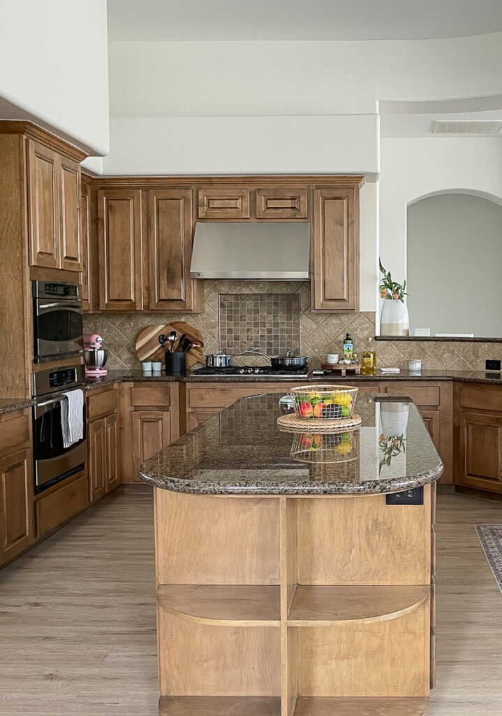
Our large oval kitchen island in the center of our kitchen is one of my favorite design elements. It’s so functional and I love spreading out and having a large area to prep while cooking. It will also be great for future entertaining.
Bar Top/Curved Peninsula
A unique element of our kitchen design is our curved peninsula + bar top area. I really despised this quirky area of our kitchen and wanted to demo it and start over. I thought about straightening it out and lowering the bar top area all together.
After a lot of thought and contemplation I realized the bar top hides our dishes in the sink from being visible from our great room. With an open concept sight lines should always be considered. Having a division between our great room and the kitchen was accomplished by this curved peninsula while also hiding our kitchen messes too!

I read an article about the benefits of having a bar height vs counter height island/peninsula here and here. It was super helpful in understanding why there are many positives instead of only looking at the downside of this unique feature.
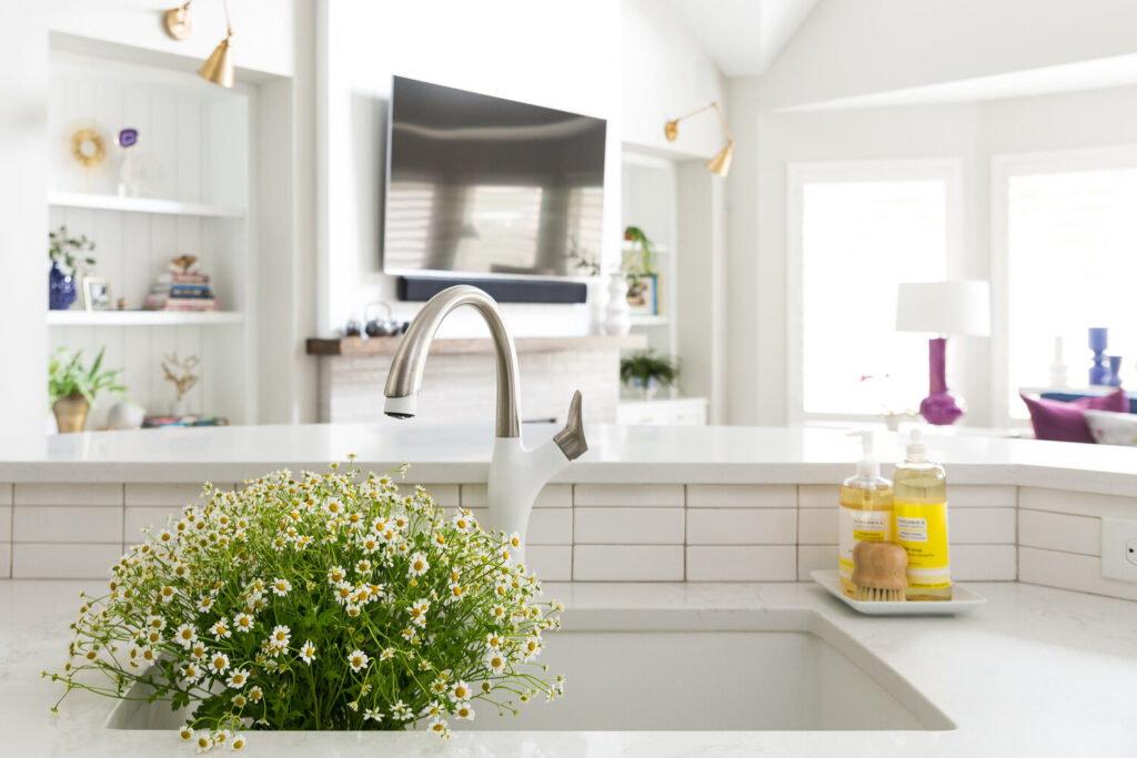
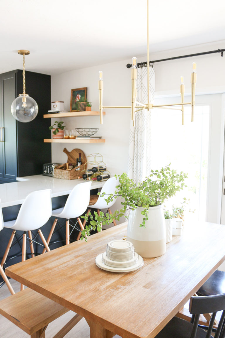
I love this bar height kitchen inspiration picture because the sight lines are almost identical to our home layout with views from our kitchen sink into our great room.
Soffits + Open Space Above Cabinets
In a perfect soffit free world we would have no soffits anywhere in our home. However with 12 foot ceilings the builder must have thought that soffits were the answer to filling the space instead of adding more cabinets. Because typically adding more cabinets equals more overall cost.
Many people opt to remove soffits in kitchens so they can add cabinets above or create a design detail to move the eye upward. We accomplished this in our builder grade home and it turned out amazing! This kitchen is not designed to easily accomplish this same goal so the soffits are staying for now. Maybe someday we will remove them but for now they are here to stay.
Sink Layout
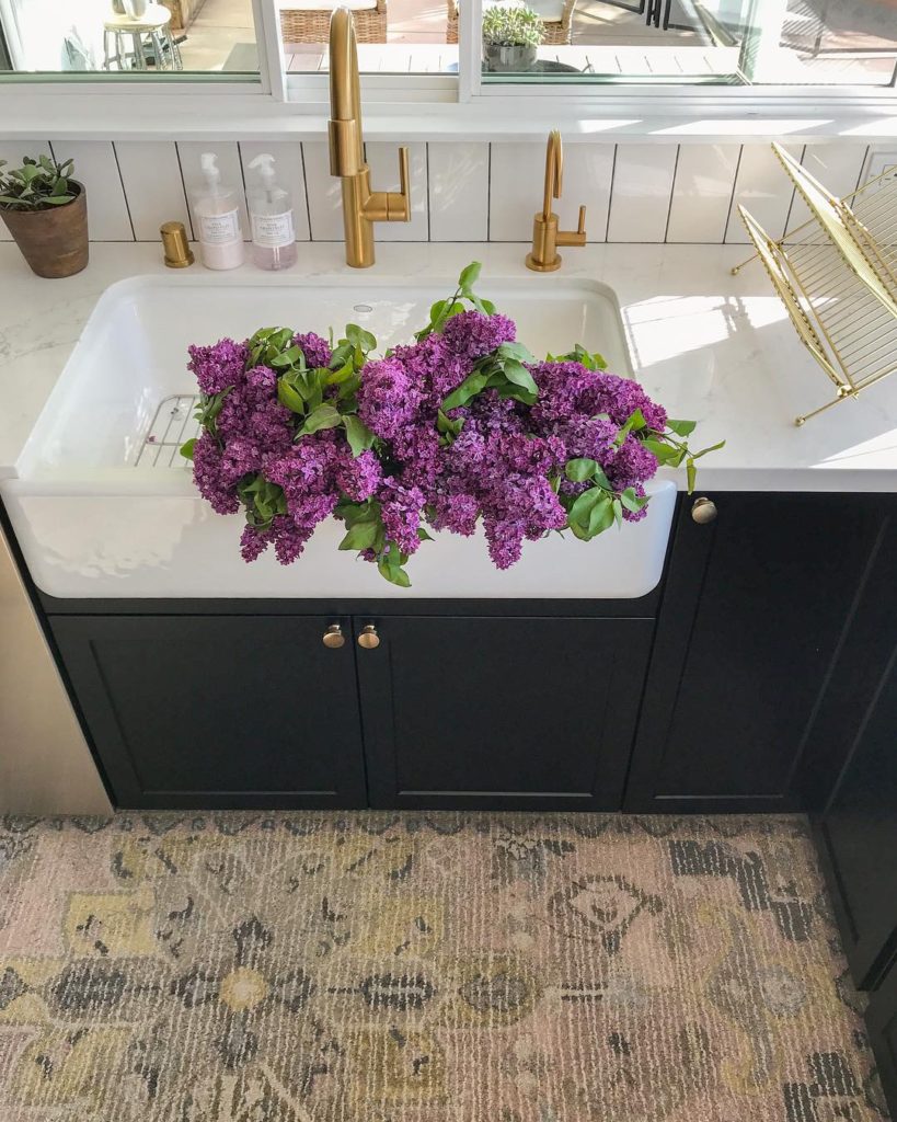
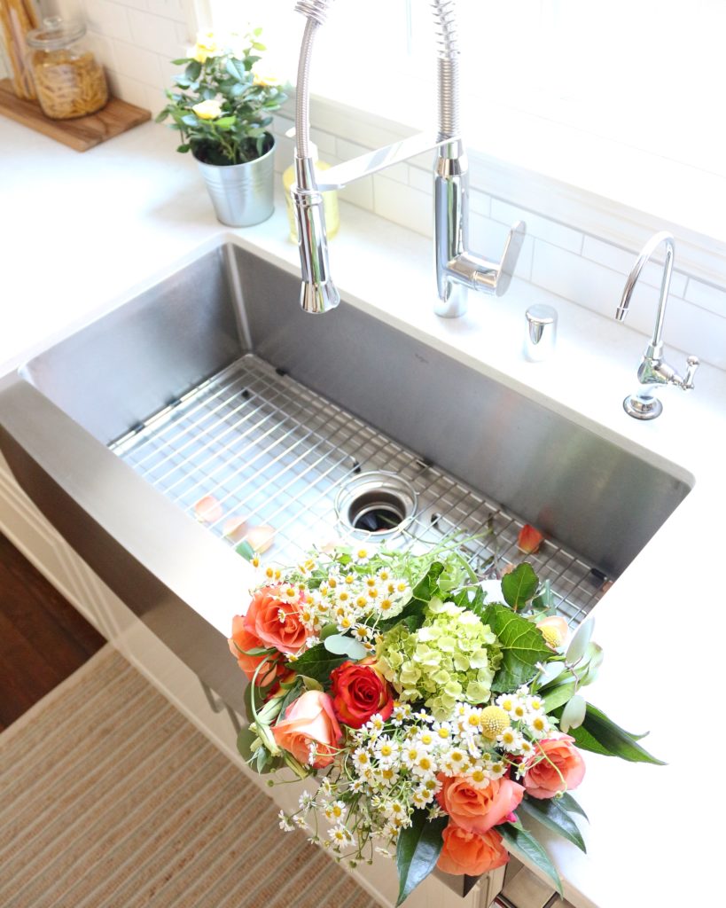
You have no idea how excited I am to go back to a large single bowl sink. If you know; you know. Single bowl sink lovers – let’s rejoice!! After 2 months with a dark black dual bowl sink that shows every water spot and looks dull and dingy I’m ready to get back to what I know and love. Washing dishes in a tiny hole vs a large single basin is difficult and annoying. The disposal was connected to the side with the smaller hole so therefore it makes doing dishes super awkward.
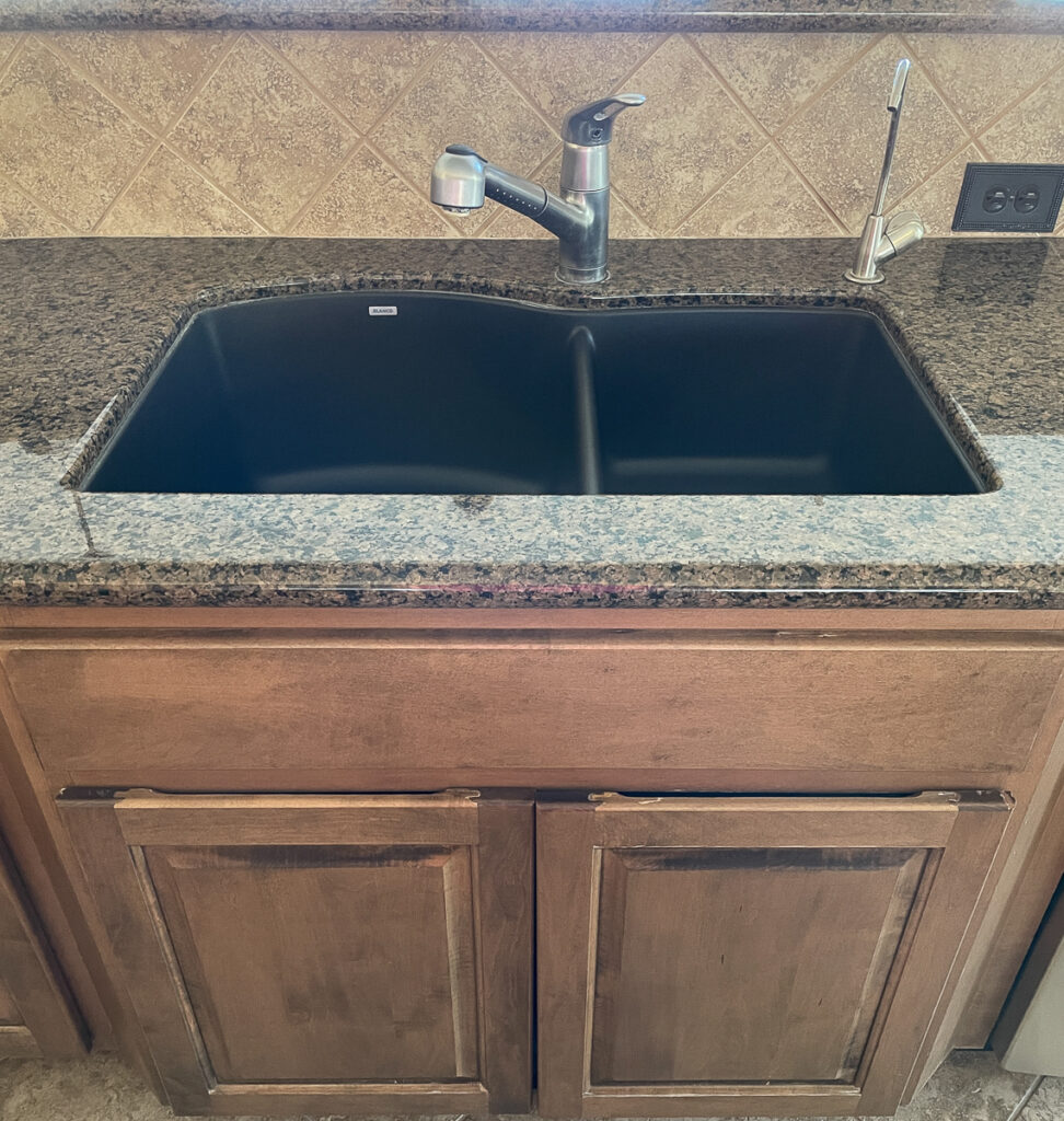
I’m replacing this awkward set-up with a large single bowl undermount sink instead of a farmhouse sink like we had in the past. We had a cast iron farmhouse sink and a stainless steel farmhouse sink in our previous 2 kitchens and they were amazing but I’m ready for a more streamlined look. Which option are you a fan of?
Kitchen Source Details
I wanted to share some of our kitchen source details with you and then next week I’ll share my kitchen design/mood board so you can see the entire look put together. This will give you a sneak peek at my vision for our kitchen space.
Sink
Cooktop
Cabinet Hardware
Faucet
Subway Tile
Countertop
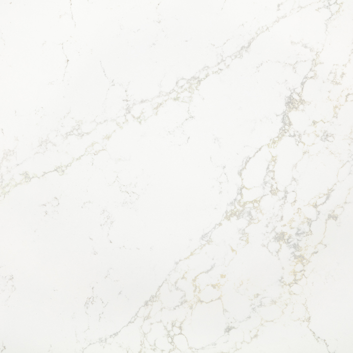
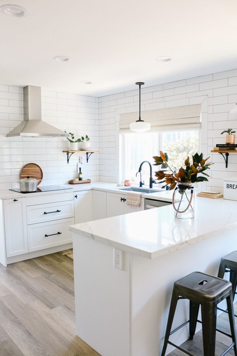
As much as I love the look of real marble the practical side of me just can’t commit to it. Therefore I have always picked quartz for our countertop selection and I’ve always been happy with it. The quartz color will have warm tones in the veining and I’m so excited to get it installed. You can see our last 2 quartz countertop colors (the same brand) in the kitchen posts here and here.
I’m counting down the days until countertop and backsplash install! I’ll be sharing more on stories and the process as we go along. Leave your comments/questions below or via my stories and I’ll add them to my upcoming kitchen posts. I’m still undecided on a cabinet paint color and may decide to keep the wood look. What do you think?
Thanks for stopping by,


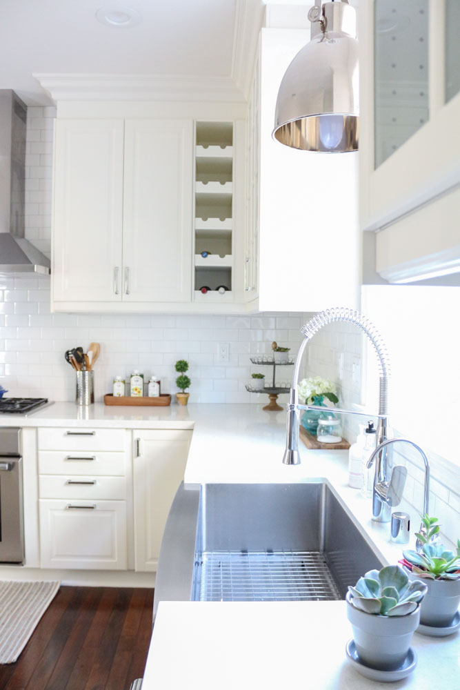

I really really love that countertop. Is it Lumina or Adagio Gold. It was hard to tell and I couldn’t find the colour name anywhere?
I updated the link – yes it’s Lumina! We love it!
Great share. Having a clear vision of your renovation goals before starting is the best key to a successful home renovation project.